
Canva Templates is reader supported. When you buy through links on our site, we may earn an affiliate commission. Learn more
Great graphic design is powered by great font selection. But picking great fonts is a challenge for most people. Luckily, Canva has made adding great fonts to your designs much easier. In this tutorial, our team of design experts will cover the best 1960s fonts in Canva.
What are 1960s Fonts?
The 1960s was a dynamic period of experimentation and change in typography and graphic design. Here are some of the key characteristics of 1960s fonts:
- Groovy and Psychedelic: Influenced by the counterculture and music of the time, many fonts from the 1960s feature swirling, flowing letters, often with a hand-drawn look. These “groovy” fonts were often used on album covers, concert posters, and in underground newspapers.
- Sans-Serif: Helvetica was released in 1957 and became highly popular during the 1960s. Its clean, simple, and versatile design represented a break from the more ornate fonts of the past.
- Futuristic: As the space race reached its height, many fonts from the 1960s embraced a futuristic look, featuring straight, geometric letterforms, often combined with stylized, space-age elements.
- Bold, Wide, and High-Contrast: Fonts like Impact and Compacta, designed in the 1960s, featured bold, condensed letters that were easy to read from a distance, perfect for advertising.
- Pop Art Influence: Influenced by the Pop Art movement, many fonts from this era featured bold, colorful designs and striking, high-contrast letterforms.
- Handwritten Script: Inspired by the individualism and personal expression of the era, many fonts from the 1960s featured a hand-drawn look, with irregular shapes and sizes and a free, flowing form.
- Experimentation: In keeping with the spirit of the times, many designers experimented with letter shapes, proportions, and layouts, leading to a wide variety of unique and creative fonts.
- Photo Typesetting: The advent of phototypesetting technology led to a wider variety of available typefaces, including many with bold, heavy weights or fine details that were not possible with older metal type technologies.
Best Canva 1960s Fonts
1. Futura

Futura’s geometric letterforms were widely used in graphic design during the 1960s, reflecting the era’s fascination with minimalism and space-age aesthetics.
2. Bodoni FLF

The Bodoni typeface, with its high contrast between thick and thin strokes, remained popular for formal and elegant design projects throughout the 1960s.
3. Univers
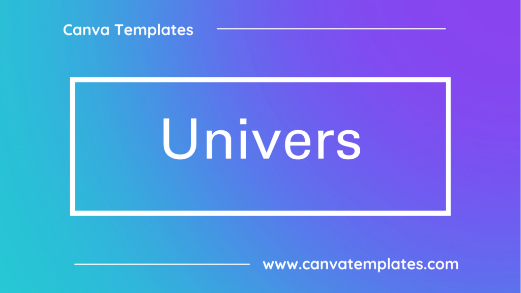
Univers is a sans-serif typeface known for its versatility and clean design, making it a popular choice for various graphic design projects during the 1960s.
4. Gill Sans

Gill Sans is an elegant sans-serif typeface was used in many advertisements and corporate designs of the 1960s, reflecting the era’s interest in a modern and refined aesthetic.
5. ITC American Typewriter

American Typewriter is a typewriter-style font was used in various publications and posters in the 1960s to evoke a sense of nostalgia and simplicity.
6. ITC Zapf Chancery

ITC Zapf Chancery is a calligraphic typeface, designed by Hermann Zapf, was used in various applications in the 1960s, especially for its script-like qualities.
7. Carta

Carta is a decorative typeface that was frequently used for retro-themed design projects and advertising during the 1960s.
8. Brush Script

Brush Script is a cursive font with a casual and handwritten appearance, making it a popular choice for 1960s signage, album covers, and more.
9. ITC Benguiat

Created in the late 1970s but associated with the 1960s and 1970s aesthetic, ITC Benguiat is known for its unique and artistic design, often seen in film titles and branding.
10. Compacta

Compacta is a condensed sans-serif typeface with a distinctive appearance, often used for a modern and impactful look in advertising and posters.
Conclusion
I hope you found this guide covering the best 1960s fonts in Canva, useful! Be sure to check out our blog for more article covering the essential tips, tricks, and advice for Canva! Also, if you haven’t already tried CanvaPro, you can try it for free for 30 days!