
Canva Templates is reader supported. When you buy through links on our site, we may earn an affiliate commission. Learn more
Great graphic design is powered by great font selection. But picking great fonts is a challenge most people. Luckily, Canva has made adding great fonts to your designs much easier. In this tutorial, our team of design experts will cover the best calendar fonts in Canva.
What Are Calendar Fonts?
Calendar fonts typically share the following characteristics:
- Clear and legible: Calendar fonts are typically designed to be clear and legible at small sizes, as they are often used in small spaces on calendars and planners.
- Sans-serif: Most calendar fonts are sans-serif, which gives them a modern, streamlined look that is well-suited to contemporary design.
- Consistent letter spacing: Calendar fonts often have consistent letter spacing, which makes them easy to read and aesthetically pleasing.
- Limited variation: Calendar fonts tend to have a limited range of variation in terms of weight and style, as they are intended to be consistent and easily recognizable across different media.
- Minimal ornamentation: Calendar fonts often have a minimalist style, with limited ornamentation or decorative elements.
- Limited color palette: Calendar fonts are typically used in a limited color palette, with black or dark-colored text on a light-colored background.
- Limited use: Calendar fonts are not typically used for body copy or large blocks of text, but rather for headings, titles, and other short bursts of text where their impact can be fully appreciated. They are commonly used in calendars, planners, and other forms of organizational communication that require a clear and concise style.
Best Calendar Themed Fonts in Canva
1. Versailles

Versailles is a decorative serif font with an elegant, ornate appearance. Its elaborate, curving letterforms and intricate details give it a luxurious, high-end feel, making it well-suited for projects that require a touch of sophistication and glamour, such as invitations, book covers, or packaging. The font’s unique style adds a sense of personality and character to any design it’s used in, lending a touch of vintage flair and visual interest. Versailles was designed by Swiss typeface designer, Xavier Dupré, and was inspired by the ornate, decorative typography of the 18th century.
2. Tomorrow

Tomorrow is a modern sans-serif font with a clean, minimalist design. Its simple, unadorned letterforms offer excellent legibility and versatility, making it suitable for a wide range of design projects, including branding, web design, and print materials. The font’s balanced, contemporary look conveys a sense of clarity and sophistication, appealing to designers seeking a refined, professional appearance in their work. Tomorrow was designed by Colombian typeface designer, Cristian Tournier, and is available in several weights and styles, making it a versatile option for a variety of design projects.
3. Optima
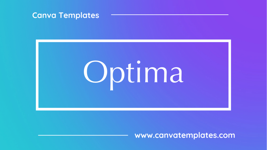
Optima is a classic serif font that was designed by Hermann Zapf in 1952. Its unique, hybrid design combines elements of both serif and sans-serif typefaces, resulting in a distinctive, elegant appearance. Its clean, balanced letterforms and even weights provide excellent legibility and versatility, making it suitable for a wide range of design projects, including branding, print materials, and digital media. The font’s timeless, modern look conveys a sense of clarity and sophistication, appealing to designers seeking a refined, professional appearance in their work. Optima is known for its legibility and readability, even at small sizes, making it a popular choice for text-heavy designs.
4. Avenir
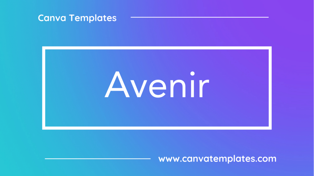
Avenir is a classic sans-serif font that was designed by Adrian Frutiger in 1988. Its clean, balanced letterforms and even weights provide excellent legibility and versatility, making it suitable for a wide range of design projects, including branding, print materials, and digital media. The font’s timeless, modern look conveys a sense of clarity and sophistication, appealing to designers seeking a refined, professional appearance in their work. Avenir is known for its wide variety of weights and styles, which offer designers a high degree of flexibility and adaptability.
5. Lato

Lato is a modern sans-serif font with a clean, minimalist design. Its simple, unadorned letterforms offer excellent legibility and versatility, making it suitable for a wide range of design projects, including branding, web design, and print materials. The font’s balanced, contemporary look conveys a sense of clarity and sophistication, appealing to designers seeking a refined, professional appearance in their work. Lato was designed by Łukasz Dziedzic and is available in several weights and styles, making it a popular choice for digital media and UI/UX design.
6. Nice

Nice is a simple and modern sans-serif font that’s clean and easy to read. It’s versatile enough to be used for a variety of projects, and its minimalist style makes it a great choice for a wide range of designs.
7. Laila Bold

Laila Bold is a bold, modern serif font with a minimalist, geometric design. Its strong, clean letterforms offer excellent legibility and versatility, making it suitable for a wide range of design projects, including branding, print materials, and digital media. The font’s balanced, contemporary look conveys a sense of clarity and sophistication, appealing to designers seeking a refined, professional appearance in their work. Laila Bold is part of the Laila typeface family, which also includes a regular weight and italic style.
8. Nunito

Nunito is a modern, geometric sans-serif font with a clean, minimalist design. Its simple, unadorned letterforms offer excellent legibility and versatility, making it suitable for a wide range of design projects, including branding, web design, and print materials. The font’s balanced, contemporary look conveys a sense of clarity and sophistication, appealing to designers seeking a refined, professional appearance in their work. Nunito was designed by Vernon Adams and is available in several weights and styles, making it a popular choice for digital media and UI/UX design.
9. Univers
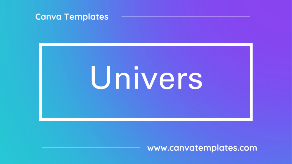
Univers is a classic sans-serif font that was designed by Adrian Frutiger in the 1950s. Its clean, balanced letterforms and even weights provide excellent legibility and versatility, making it suitable for a wide range of design projects, including branding, print materials, and digital media. The font’s timeless, modern look conveys a sense of clarity and sophistication, appealing to designers seeking a refined, professional appearance in their work. Univers is known for its extensive family of weights and widths, which offer designers a high degree of flexibility and adaptability.
10. Poppins

Poppins is a modern, geometric sans-serif font with a clean, minimalistic design. Its simple, unadorned letterforms offer excellent legibility and versatility, making it suitable for a wide range of design projects, including branding, web design, and print materials. The font’s balanced, contemporary look conveys a sense of clarity and sophistication, appealing to designers seeking a refined, professional appearance in their work. Poppins was designed by Indian Type Foundry, and its name comes from the fact that many of the streets in Mumbai are named after famous people, including Mary Poppins.
Conclusion
I hope you found this guide covering the best calendar fonts in Canva, useful! Be sure to check out our blog for more article covering the essential tips, tricks, and advice for Canva! Also, if you haven’t already tried CanvaPro, you can try it for free for 30 days!